Preventing a Product Color Mismatch
Draper's & Damon's | Color Accuracy & Quality Control
The Challenge
During final production of a Draper's & Damon's seasonal catalog, I noticed that a "Harbor Blue" activewear collection appeared noticeably different from its representation in previous catalogs and related product lines.
With the catalog approaching print deadlines, the discrepancy posed a significant business risk. Customers could receive a product that looked different from what they expected, potentially leading to increased returns, customer dissatisfaction, and reduced confidence in the brand.
Although identifying the root cause fell outside my immediate responsibilities as a Digital Imaging Specialist, I took the initiative to investigate the discrepancy before the catalog went to press, ensuring the product was represented accurately while maintaining brand standards.
The Goal
Determine the source of the color discrepancy.
Ensure customers received an accurate representation of the product.
Resolve the issue without delaying catalog production.
Provide stakeholders with reliable imagery while maintaining publication deadlines.
The Solution
Rather than relying solely on photography samples, I proactively contacted the merchandising team and requested official fabric swatches for comparison.
To avoid production delays, the swatches were expedited, allowing me to perform a detailed review of:
Physical fabric samples
Digital product photography
Catalog proofs
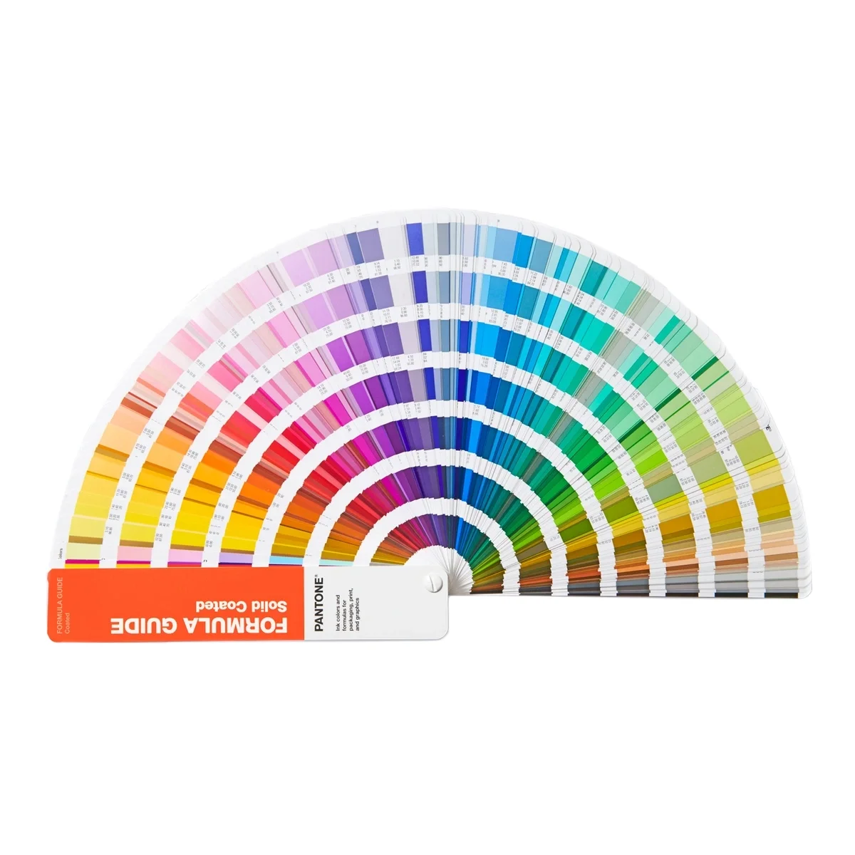
Using calibrated color-management workflows and Pantone Connect, I analyzed color values across multiple assets.
This revealed that the discrepancy was not caused by photography or retouching but by a variation in the fabric dyeing process.
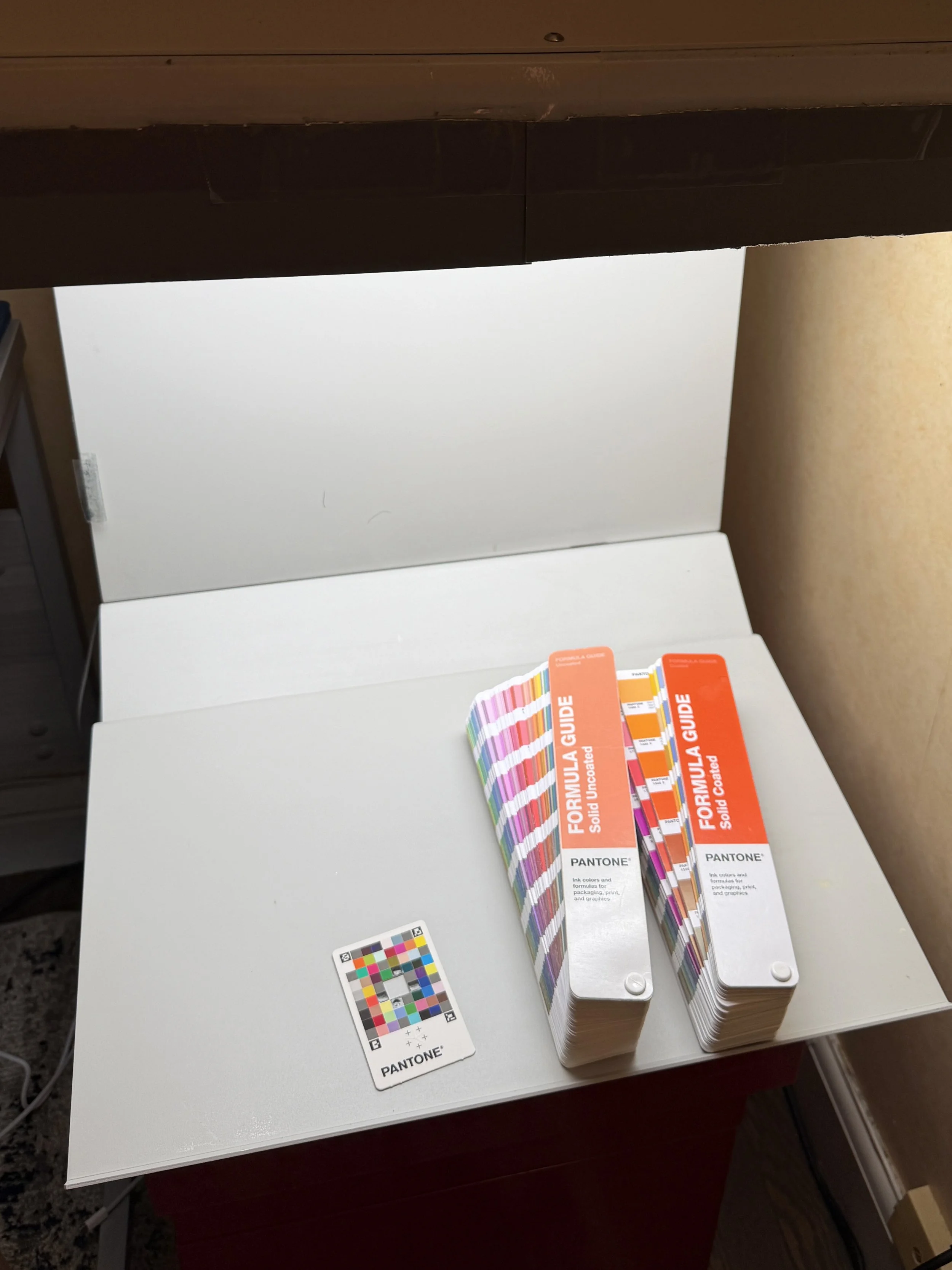
Implemented a standardized color evaluation workflow using Pantone Connect and a Graphiclite/Graphilite PDV by GTI viewing booth.
Resolving the discrepancy required close collaboration with merchandising and marketing stakeholders to ensure the final imagery accurately reflected the product while keeping the catalog on schedule.
The project also demonstrated the value of incorporating physical fabric swatches earlier in the color-review process.
The Outcome
Prevented Inaccurate Product Representation
The issue was identified and corrected before publication, helping ensure customers received an accurate representation of the product and reducing the risk of returns, complaints, and negative reviews.
Improved Cross-Functional Collaboration
The project strengthened communication between imaging, merchandising, and marketing teams, creating a more effective review and approval process.
Established a Stronger Workflow
The experience led to improved color-verification procedures that helped prevent similar issues in future catalog production cycles.
Business Impact
By taking ownership of an issue outside my immediate responsibilities, I helped prevent inaccurate product representation, protect customer trust, and improve quality-control processes that benefited future catalog production.